Designing a Cover for Widow Walk
The design of cover and artwork has been part of the joy for this project. As soon as my excellent editor, Sherry Roberts, finished her second set of edits on the manuscript, I began working with artists for the cover. Attached below are several early concept drawings and photographs by Carey Pelto, MD, Randy Mott of Mott Graphics, and the Greenleaf Publishing cover artist, Neil Gonzalez.
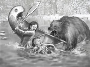
The first iterations were attempts at taking specific scenes from different chapters in the tradition of picture books:
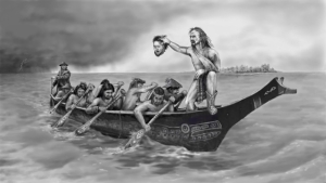
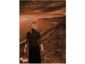
Then we tried theme concepts from the book, again starting with the story of the headhunters and then with Emmy’s epic journey and suffering:
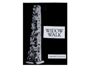
Then, when trusted advisors did not respond well to these ideas, Randy Mott and I started working on alternative themes for the cover. I have always been impressed with the Haida black shale argellite carving and love the Pacific Northwest aboriginal story-telling and totem myths: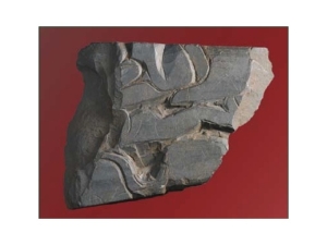
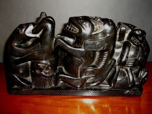

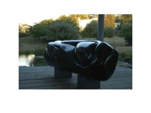
Most of my own basalt sculpture, like this 7’x3’x3′ piece (“Psyche”) on Maury Island is a tribute to their ancestral art:
So, I did a mock up of a cover that incorporated the feel of that imagery:
Randy Mott researched Haida art and did this mock up with a medallion rather than a totem pole:
The response from various readers and artist friends was very positive. But rather than using an existing tribal image, I decided we should design and copyright our own. I discussed with Randy the concepts of personal totems incorporating the animals that are so important to PNW tribal lore and are represented by the characters in Widow Walk…I think you can determine who these are after you read the book.

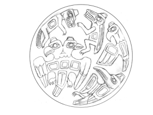
When satisfied with the imagery, I asked Randy to make the totems interact as they do in the story:

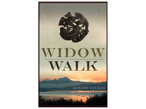
After several other prototypes, Randy completed the design with the image of the medallion resembling an argillite Haida carving. I approved the cover for the first edition of Widow Walk:
After the book was picked up by Greenleaf Publishing, I had the opportunity to work with their graphics designer, Neil Gonzalez. We agreed to keep the medallion we had designed, but test other four other concepts that might appeal to a broader audience. We tested the covers with a total of 40 folks from a broad cross section of potential readers:
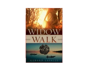
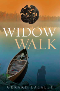
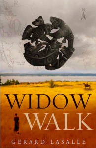
The final cover for the second edition in hardcover has an embossed medallion and internal maps to guide the reader through the first of three books in “The Widow Walk Saga”
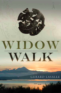


![Pageflex Persona [document: PRS0000030_00044]](https://www.garlasalle.com/wp-content/uploads/2013/06/LaSalle-WidowWalk-frontcover-5-196x300.jpg)
Wow! What an intense and yet fruitful process! Not exactly like falling off a log. I’m impressed. And the results are beautiful and thought-provoking.
Paul